
When I think about creating a Christian-inspired home, I always find myself drawn to colors that feel peaceful, meaningful, and rooted in God’s presence. Certain shades just carry a quiet sense of comfort—soft whites that remind me of purity, gentle blues that reflect trust and calm, warm gold tones that feel like God’s light, and deep greens that speak of renewal and life.
Table of Contents
ToggleI love how using intentional color can shift the entire atmosphere of a room, making it feel more grounded, sacred, and connected to faith. These Christian color schemes aren’t just about decorating; they’re about surrounding yourself with reminders of God’s truth and goodness in everyday spaces. Whether I’m refreshing a small corner or reimagining a full room, choosing spiritually meaningful colors helps me create a home that feels warm, welcoming, and centered on Christ.
If you want décor that reflects faith in subtle, beautiful ways, these palettes are a lovely place to begin.
Christian Color Schemes for Your Home Decor

Soft White and Ivory Serenity
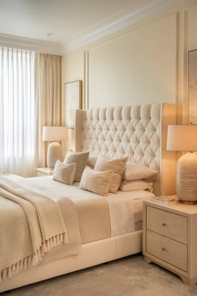
Source: Pinterest
Soft whites and ivory tones always make my home feel peaceful and grounded. I love how these shades bring a sense of purity and calm that reflects Christ’s presence in the simplest, most beautiful way. When I use these colors in my décor—whether it’s curtains, throws, or wall paint—the whole space feels brighter and more open. What I enjoy most is how neutral they are, giving me room to layer in small accents like wooden crosses, Scripture art, or natural textures. This color scheme creates a quiet atmosphere, almost like a gentle reminder to slow down, breathe, and stay centered in faith.
Heavenly Blue and Cloud Gray
Blue has always felt like a color of trust, comfort, and stillness to me, especially when paired with soft cloud-gray accents. These tones instantly create a calm, prayerful atmosphere, perfect for spaces where I want to reflect or unwind. I love using them in bedrooms, reading nooks, or quiet corners because they make the room feel peaceful without being plain. Blue also reminds me of God’s faithfulness and the vastness of His presence, which adds meaning to the décor. This palette works beautifully with silver frames, minimal artwork, or gentle lighting that brings out the soothing tones.
Golden Light and Warm Beige
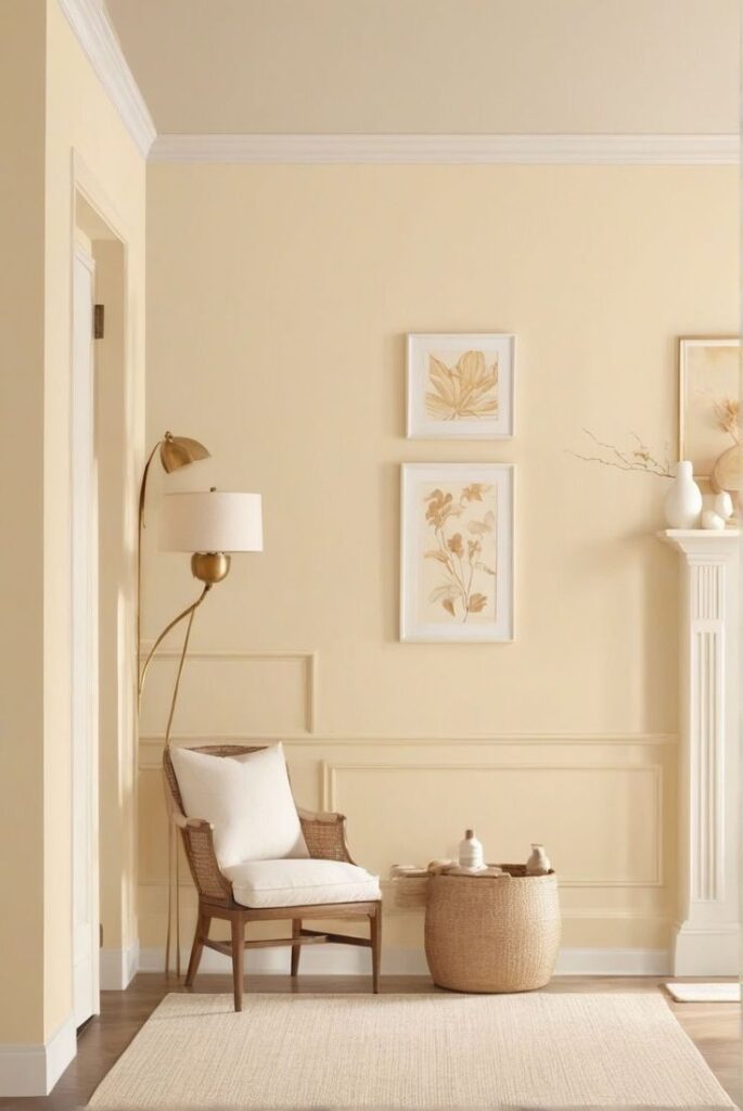
Source: Pinterest
Warm gold paired with soft beige always makes my home feel inviting and full of joy. These shades remind me of God’s glory—bright, warm, and comforting. I enjoy using gold accents through mirrors, candle holders, or small décor pieces, while keeping the base neutral so the glow feels subtle rather than overwhelming. This palette brings a gentle elegance that reflects gratitude and warmth. It’s perfect for living rooms or dining areas where I want guests to feel welcomed and embraced. Every time I decorate with these colors, the whole space feels uplifted and full of God’s light.
Olive Green and Natural Wood
Olive green mixed with natural wood tones gives such a refreshing, earthy feel. This palette reminds me of new growth, renewal, and the steady patience of God’s timing. I love incorporating it through plants, wooden shelves, woven baskets, and soft green textiles. It brings nature indoors in a meaningful way, creating a room that feels grounded and alive. These tones work especially well in entryways or kitchens where I want a peaceful yet warm atmosphere. It’s a beautiful combination that reflects simplicity, gratitude, and steady faith.
Deep Navy and Antique Gold
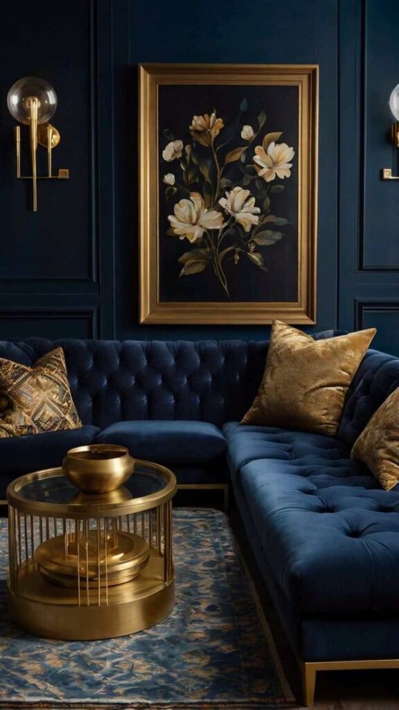
Deep navy paired with antique gold brings a sense of reverence and depth to any room. Navy feels strong and trustworthy, while gold adds just the right touch of elegance. Together, they remind me of worship, holiness, and the beauty of God’s presence. I love using this palette in studies, prayer rooms, or bedrooms where I want a richer, more reflective feel. Small touches like Scripture wall art, candles, or gold-framed decor really bring the look together. It’s a color scheme that feels meaningful, mature, and full of spiritual depth.
Blush Rose and Warm Cream
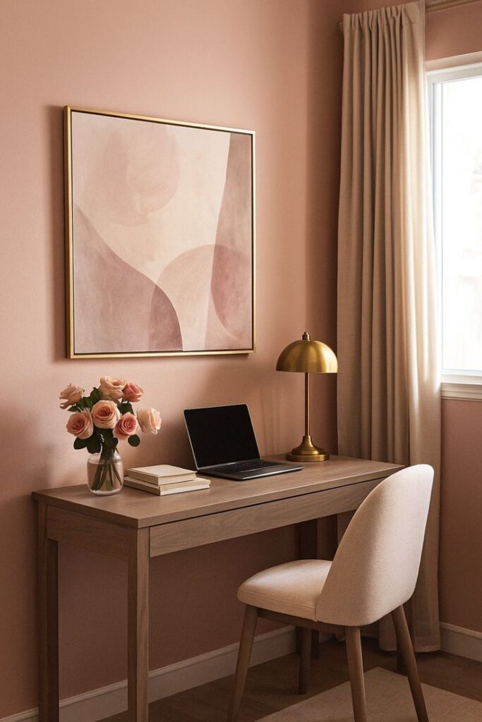
Blush rose and warm cream bring such a gentle, uplifting warmth to any space. This palette reminds me of God’s tenderness—soft, compassionate, and full of love. I love using these colors in bedrooms or cozy sitting areas where comfort really matters. The combination feels feminine without being overdone and adds a soft glow that’s perfect for moments of rest or reflection. Pink tones pair beautifully with lace, soft textures, and gold accents. The result is a peaceful, heart-centered space that feels cozy, graceful, and full of quiet joy.
Sage Green and White Linen
Sage green is such a calming, restorative shade, especially when paired with clean white linen tones. The combination reminds me of still mornings, prayerful moments, and God’s gentle guidance. I love using this palette for spaces where I want mental clarity and emotional peace. Sage works well for accent walls, cushions, or small furniture pieces, while white adds brightness and simplicity. Together, they create an airy, refreshing energy that feels soothing and spiritually grounding. It’s the perfect palette for anyone who wants a Christ-centered home that feels both peaceful and natural.
Burgundy and Soft Taupe
Burgundy and soft taupe create a warm, comforting palette that feels rich without being overwhelming. Burgundy reminds me of depth, devotion, and the richness of God’s love, while taupe keeps everything calm and balanced. I love using this combination in living rooms or dining spaces where warmth and connection matter. Add cozy blankets, textured pillows, or minimal artwork to complete the look. This palette especially shines during fall and winter, creating a comforting atmosphere perfect for family gatherings and quiet evenings at home.
Charcoal Gray and Pure White
Charcoal gray paired with pure white gives a modern, timeless Christian look that feels clean and grounded. I love how the contrast creates clarity and simplicity, almost like a reminder of staying focused on what truly matters. These tones work well in bedrooms, offices, or prayer spaces where you want stillness and balance. White brightens the space, while charcoal adds depth and structure. Add simple Christian décor—wooden crosses, Scripture prints, or candles—and the palette feels elegant without losing its spiritual character.
Soft Lavender and Silver
Soft lavender paired with silver creates a gentle, heavenly color scheme that feels both peaceful and uplifting. Lavender always reminds me of rest, healing, and God’s calming grace. I love using this palette in bedrooms or quiet reading corners where I want a soothing environment. Silver accents—like frames, lamps, or decorative pieces—add a subtle shimmer that completes the look without overpowering it. This combination feels perfect for anyone wanting a spiritually refreshing space that encourages reflection, rest, and emotional peace.
Rustic Brown and Off-White
Rustic brown and off-white bring a cozy, farmhouse-style Christian feel to the home. These shades remind me of simplicity, warmth, and gratitude. I love incorporating wooden furniture, woven baskets, and soft off-white fabrics for a clean yet homey atmosphere. Add touches of greenery or Scripture signs, and the entire room feels grounded and welcoming. This palette is perfect for kitchens, living rooms, or entryways—anywhere you want a natural, Christ-centered warmth.
Aqua Blue and Sandy Tan
Aqua blue and sandy tan create a light, refreshing palette that feels like peace and freedom. These beachy tones remind me of God’s creation and the calmness of the sea. I love using this color scheme in bathrooms, sunrooms, or spaces where natural light shines. Aqua brings brightness, while sandy tan adds warmth and balance. The result feels clean, airy, and spiritually refreshing. Add seashell accents, white décor, or Scripture art for a gentle coastal Christian touch.
Forest Green and Gold
Forest green paired with gold creates a rich, elegant palette that feels both grounded and radiant. Forest green reminds me of growth, strength, and renewal, while gold symbolizes God’s glory. I love using this palette during Christmas, but it’s beautiful year-round in bedrooms or living spaces. It brings depth, warmth, and a sense of spiritual richness. Add gold-framed art or green velvet cushions to make the look feel intentional and cozy.
Muted Mustard and Cream
Muted mustard paired with cream gives a warm, inviting glow to any room. Mustard brings cheerful energy without being too bright, while cream softens everything. The palette feels joyful, thankful, and full of life—perfect for family-centered spaces. I love using it in kitchens or dining rooms for a cozy, uplifting feel. Add wooden accents or greenery to complete the look. It’s a beautiful reminder of gratitude and God’s everyday blessings.
Sky Blue and Driftwood Gray
Sky blue and driftwood gray offer a gentle, airy palette that feels peaceful and deeply calming. Sky blue reminds me of hope and God’s presence, while driftwood gray adds balance and softness. I love using this palette in living rooms or prayer spaces where quiet moments matter. It’s clean, soothing, and easy to decorate with natural materials and Scripture accents. This palette creates a peaceful Christian home atmosphere that never feels heavy.
FAQ
How do I choose a Christian color scheme for my home?
I usually start by thinking about how I want the room to feel—peaceful, joyful, reflective, or cozy. Then I pick colors that match those emotions and also hold spiritual meaning, like white for purity or blue for trust.
Are Christian color schemes only neutral?
Not at all. While soft neutrals feel calming, rich tones like burgundy, navy, and forest green also carry beautiful faith symbolism. It’s all about choosing what reflects your heart and your style.
Can I mix different Christian-inspired colors?
Yes! Blending tones like ivory with gold or sage with white creates meaningful combinations that still feel balanced. Mixing colors works as long as the palette stays soft and intentional.
Do these colors work in modern homes?
Absolutely. Christian-inspired palettes are very versatile. Whether your home is modern, coastal, rustic, or minimal, these colors add warmth, meaning, and a peaceful atmosphere.
How can I make the colors feel more faith-focused?
Small touches help—Scripture art, wooden crosses, candles, or natural textures that reflect God’s creation. These pieces tie the color scheme back to your faith beautifully.
Which rooms are best for Christian color schemes?
Honestly, any space works. Soft tones are lovely for bedrooms, richer colors fit dining rooms, and peaceful blues or whites feel perfect for prayer spaces or reading corners.
Are Christian color palettes expensive to recreate?
They don’t have to be. Simple updates like throw pillows, blankets, budget-friendly wall prints, or a fresh coat of paint can completely transform the room without spending much.
Can bold colors still feel Christ-centered?
Yes, bold colors like navy, burgundy, or mustard carry depth and meaning. When paired with natural elements or Scripture pieces, they feel just as faith-filled as softer tones.

I’m father joaquin perez, we are a catholic church with all the sacraments where everybody is welcome. we celebrate catholic mass every Sunday at 12:30pm at saint stephen episcopal church at 2750 McFarlane road, Miami, Florida